Chart Indicators
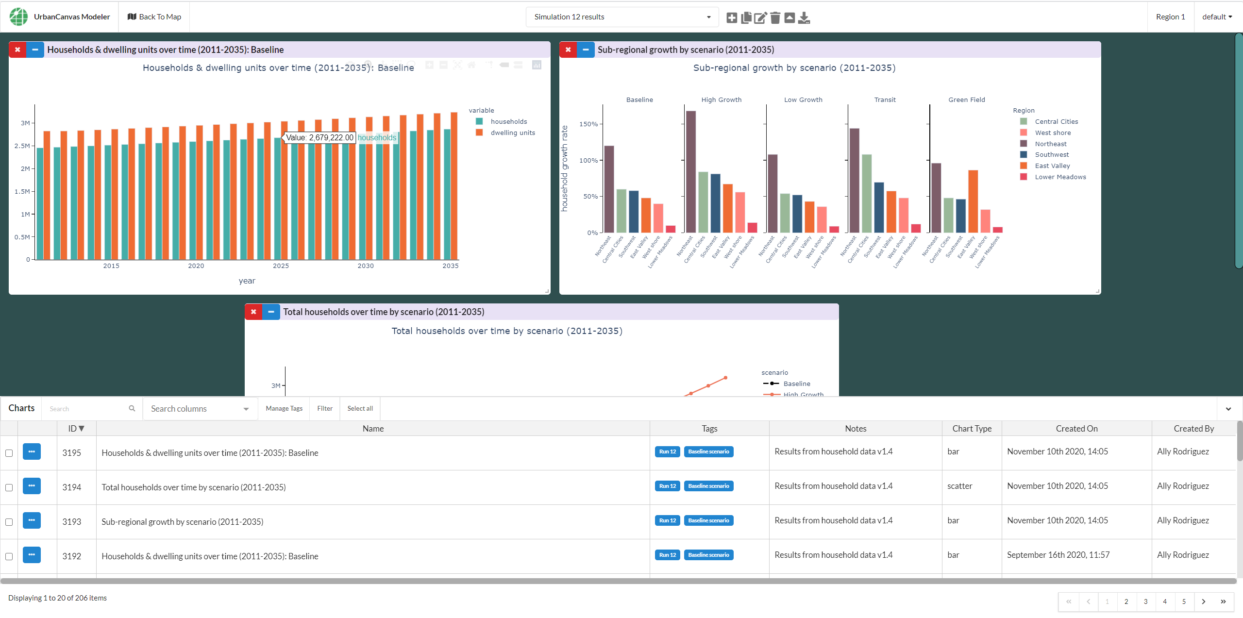
After a successful simulation run, a selection of indicators (e.g. derived variables) for that run are available to visualize as charts if your simulation was configured to export pre-defined charts prior to the run. Charts can be viewed and managed using the chart dashboard. To open the chart dashboard click on the chart icon ![]() at the top right hand side of UrbanCanvas.
at the top right hand side of UrbanCanvas.
The content and layout of charts created from simulation runs is controlled by your specific model implementation and configuration. Chart data and basic layout cannot be modified from within UrbanCanvas. All model types (e.g. Block, Zone, Parcel) can have a customized list of charts autogenerated. However, due to the Block model’s use of standardized data there are a set of default pre-selected charts available here. Parcel and zone model chart indicators can vary widely based on the type of base data utilized. Parcel and zone model indicators can be fully customized depending on the customization of your model system and the data utilized.
Examples of Plotly charts
An example of an Altair chart
Note
If you do not see a pre-calculated indicator you require, you can request new indicators to be added to the next version by submitting a feature request as long as your model base data supports the calculation of the indicator.
Calculation of Indicators
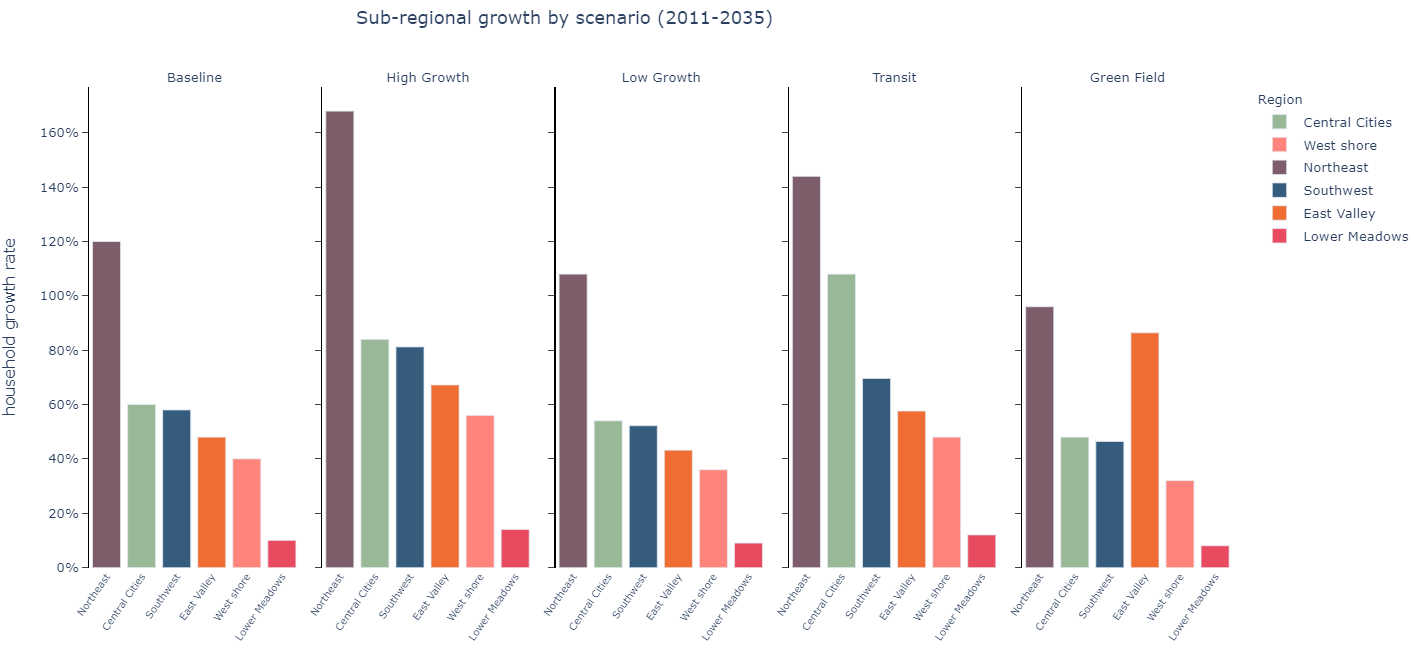
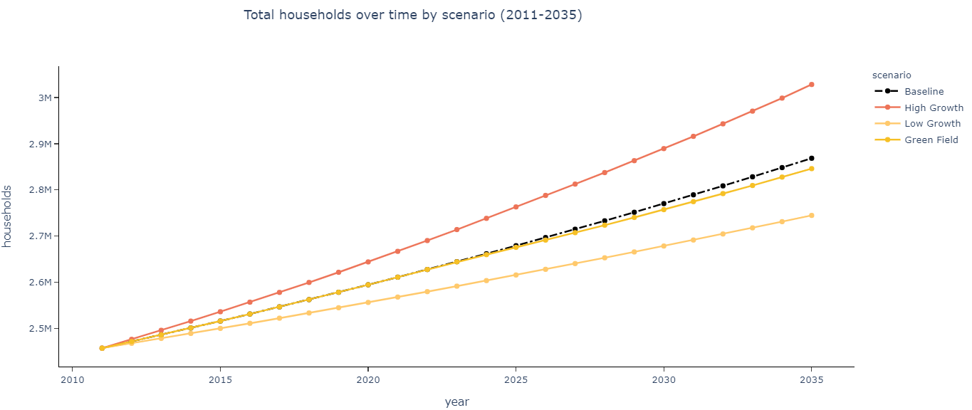
Indicator variables are auto-generated upon completion of each simulation run and can be visualized in charts. All indicators are calculated at the base data level of geography (e.g. Census block, parcel or zone) and are typically summed or averaged to larger geographies.
UrbanCanvas currently supports rendering of charts directly exported from Python using either the declarative statistical visualization libraries: 1) Altair or 2) Plotly. Plotly charts are fully interactive in UrbanCanvas, however Altair charts are not interactive and are static. See the chart dashboard for more information on chart interactivity.
Note
The types of indicators exported at the end of the simulation will be dependent upon your needs determined through your model development consulting contract and can be customized. The indicators displayed in this section are for example only.
Chart Metadata
Charts automatically generated by simulation runs will be given the following default metadata properties:
Chart records will be given names as configured by your specific model implementation but will typically be the same name as the chart title defined by Altair or Plotly. Charts will be tagged with the unique identifier number of the simulation run (e.g. Run 32) that generated it which allows for easy data management and filtering from within the chart dashboard. Charts will not have created by information and will be shown as created by N/A. Charts will have a created on timestamp that reflects when the chart was exported to UrbanCanvas.
Block model chart examples
Indicators can be fully customized depending on the customization of your model system and the data utilized. This list is intended as a example of indicators that can be generated and is not exhaustive.
Chart Name |
|---|
Total Jobs by Sector |
Top Ten Blocks: Population per Acre |
Top Ten Blocks: Jobs per Acre |
Top Ten Blocks: Jobs |
Top Ten Blocks: Households per Acre |
Top Ten Blocks: Households |
Top Ten Blocks: Dwelling Units per Acre |
Top Ten Blocks: Dwelling Units |
Household Tenure |
Histogram: Residential units within 3km on street network (natural log) |
Histogram: Residential Values |
Histogram: Residential Rents |
Histogram: Population within 1.5km on street network (natural log) |
Histogram: Jobs within 5km on street network (natural log) |
Histogram: Jobs within 20km on street network (natural log) |
Census Tract Scatterplot: Total Jobs vs. Total Households |
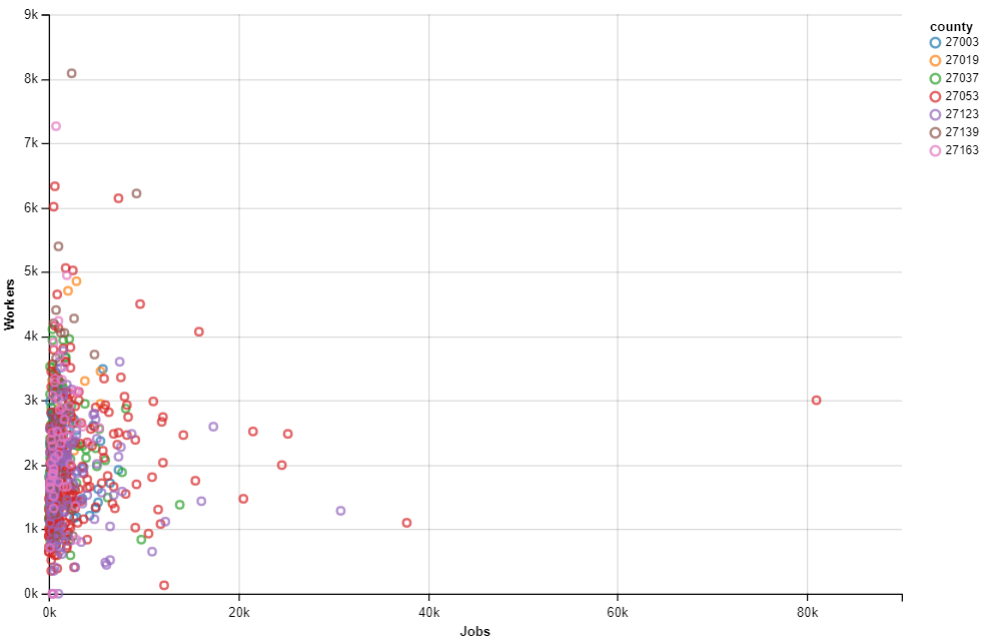
Census Tract Scatterplot: Total Jobs vs. Total Workers |
Census Tract Scatterplot: Total Households vs. Total Dwelling Units |
Census Tract Scatterplot: Mean Number of Jobs within 20km on street network (natural log) vs. Total Households |
Census Tract Scatterplot: Mean Income vs. Mean Housing Value |
Census Tract Scatterplot: Mean Households per Acre vs. Mean Housing Value |
By County: Total Workers |
By County: Total Population |
By County: Total Jobs by Sector |
By County: Total Jobs |
By County: Total Households |
By County: Total Dwelling Units |
By County: Share of growth from base year to forecast year |
By County: Mean Household Size |
By County: Mean Household Income |
By County: Household Tenure |
By County: Growth from base year to forecast year |
By County: Average Rent |
By County: Average Population per Acre |
By County: Average Jobs per Acre |
By County: Average Housing Value |
By County: Average Households per Acre |
By County: Average Dwelling Units per Acre |
Parcel and Zone model chart examples
Parcel and zone model indicators can be fully customized depending on the customization of your model system and the data utilized.